
Interior design websites often offer catalogs with hundreds, or even thousands, of products. With so much to choose from, navigation becomes a challenge in its own right: finding a specific item or simply exploring different décor styles means understanding how the site organizes its sections, filters, and search journeys. Good navigation depends as much on menu design as on how product data is structured behind the scenes.
Looking for a home décor item without knowing its name: where to start
Most visitors to an interior design website don’t arrive with a specific product in mind. They’re looking for “something for the living room wall” or “something wooden for the bathroom.” This uncertainty is perfectly normal, but it puts conventional navigation systems—designed for precise searches—to the test.
A menu organized solely by product type (lighting, furniture, textiles) assumes that visitors already know which category to look in. For someone choosing between a wall shelf and a decorative picture frame, this kind of classification can lead to a dead end.
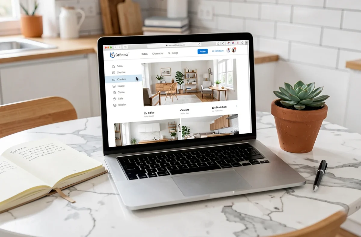
Websites that handle this well offer a browse by room option alongside browsing by category. Exploring “Living Room,” “Bedroom,” or “Kitchen” lets visitors picture a complete look without having to name the item they’re after. This dual approach—by product type and by room—reduces the number of clicks needed to find a relevant selection.
Some catalogs also let visitors browse by style (Scandinavian, industrial, bohemian), which is useful when they’re looking for inspiration. But this option is only reliable if every product listing has been manually tagged with the right style—a substantial editorial task that not every website carries out properly. Exploring the Cherry Déco sitemap shows how a clear site structure organizes all the sections and makes it easier to browse step by step.

Home décor search filters: what works and what doesn’t
After menus, filters are the next most important navigation tool. On an interior design website, visitors typically expect to filter by color, material, dimensions, and price range. How useful these filters actually are depends on a factor that’s often invisible to visitors.
A filter can only work if the corresponding information is provided for every product. If half the items don’t list their material, filtering by “wood” will return only a fraction of the actual catalog. The results make it seem as though there’s little to choose from, when the real problem is incomplete product data.
Active filters on mobile: a common pitfall
On a smartphone screen, filters are usually hidden behind a button or in a side panel. Once selected, they disappear from view. Visitors can keep scrolling through products without knowing which filters are still active.
Showing active filters at the top of the results list and letting visitors remove them one at a time without reloading the entire page means they don’t have to reopen the panel to check their selections. This may seem like a minor detail, but it makes browsing on mobile much smoother—especially since most visits to home décor websites happen on mobile devices.
Filter combinations and search engine visibility
Each filter combination generates a unique URL. An interior design website offering five colors, four materials, and three price ranges can generate dozens of combinations. Making all these pages accessible to search engines creates a problem: crawlers spend time on low-value pages instead of the catalog’s main pages.
Well-managed websites are selective: only the most popular combinations (for example, “round wooden mirror”) become indexable pages. Visitors can still use other combinations, but those pages are excluded from search engine crawling. Balancing user navigation with SEO visibility is a technical decision that directly affects how easy it is to find the website through a Google search.
Accessibility on home décor websites: a requirement since June 2025
Since June 28, 2025, the European Accessibility Act has applied to certain online retail services. Navigation, search, and filtering journeys must be usable with a keyboard and assistive technologies such as screen readers and voice navigation.
In practice, this means that menus, filters, and buttons on an interior design website can no longer rely solely on mouse interactions. A menu that opens on hover but not with a keyboard, or a filter that can only be activated by touch gestures, now presents a regulatory issue for the websites concerned.
The scope and exemptions vary depending on company size and national transposition rules. Not all interior design websites are subject to the same requirements. However, the overall trend is pushing the e-commerce sector toward interfaces that can be navigated using all types of interaction.
Interior design sections: three ways to assess a website
Before spending time browsing a catalog, a few quick checks can help you determine whether the website’s navigation will be smooth or frustrating.
- The main menu offers at least two ways to browse (by product type and by room, or by style). A menu organized only alphabetically or by brand makes it harder for visitors to discover products when they’re still exploring.
- Filters show a result count next to each option. This prevents you from selecting “Rattan” only to find that no products match, forcing you to go back.
- The search bar accepts vague descriptions (“small table lamp”) and returns relevant suggestions, not just exact matches. Search that accommodates imprecise wording is a sign of a well-structured catalog behind the scenes.
These three points don’t guarantee a perfect experience, but they indicate that the website’s navigation has been designed for real users—not just shoppers who already know exactly what they want.
How easy an interior design website is to navigate depends less on how attractive its menu looks than on the quality of the data associated with each product. A filter by material or color is only useful if that information is included in every product listing. Checking a website’s structure before getting lost in its catalog is the best way to save time.